Matplotlib
파트, 플롯으로 시각화하는 패키지
https://matplotlib.org/stable/gallery/
Examples — Matplotlib 3.10.9 documentation
Examples For an overview of the plotting methods we provide, see Plot types This page contains example plots. Click on any image to see the full image and source code. For longer tutorials, see our tutorials page. You can also find external resources and a
matplotlib.org
pyplot
matpotlib의 서브패키지
애트랩이라는 수치해석 소프트웨어 시각화명령을 그대로 사용할 수 있다
matplotlib는 mpl, pylpot은 plt라는 별칭이 관례이다.
쥬피터 노트북을 사용하는경우 #matplotlib inline 노트북 내부에 그림을 표시하도록 지정한다
title() 제목
show() 차트 렌더링
plot 라인플롯
데이터가 시간, 순서등에 따라 어떻게 변화하는지를 보여준다.
x축의 데이터가 없다면 자료 위치 tick은 자동으로 -, 1, 2, 3이 된다.


한글폰트사용하기 마음에 드는 폰트 다운
https://hangeul.naver.com/font
네이버 글꼴 모음
네이버가 만든 150여종의 글꼴을 한번에 만나보세요
hangeul.naver.com
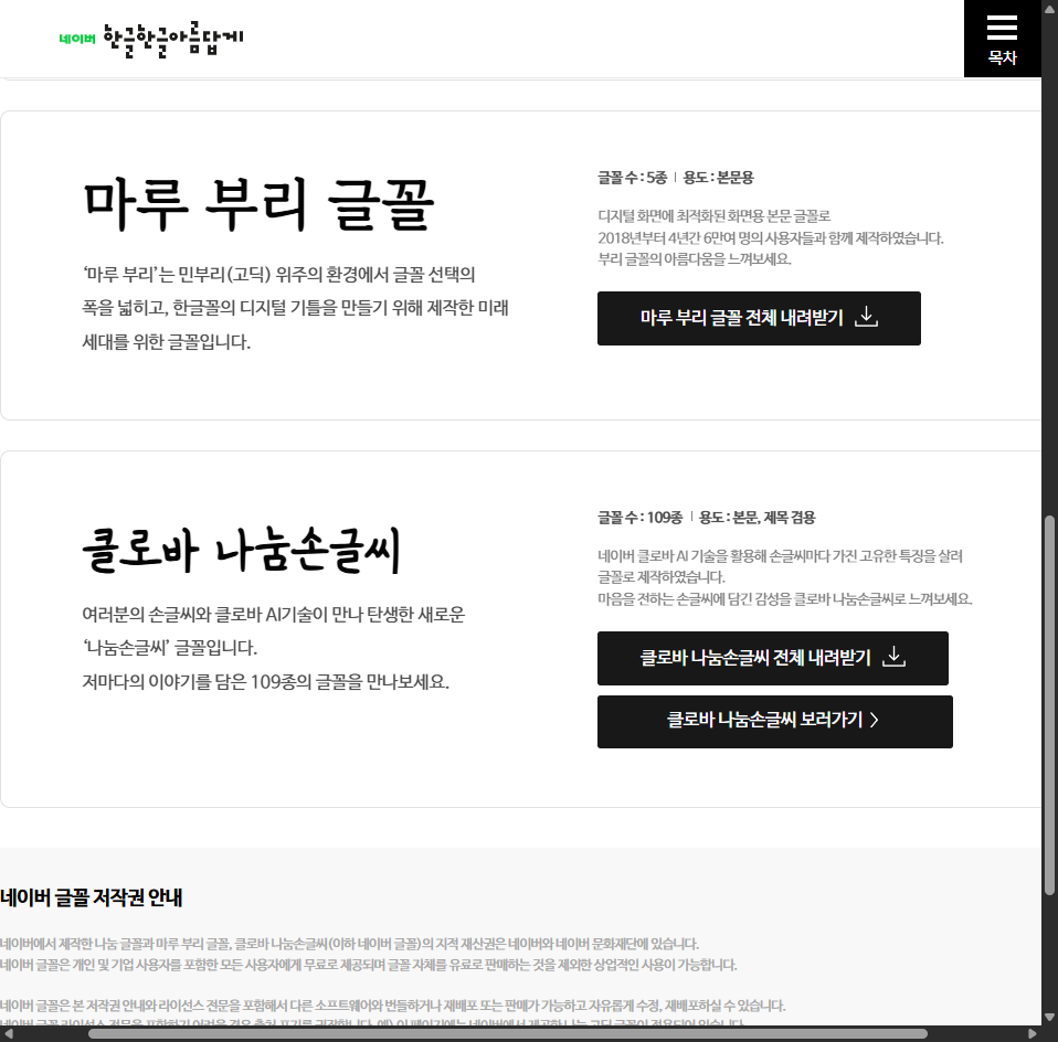
root경로에 압축풀기
파일의 상위 디렉토리에서 파일의 절대경로 찾기
script_dir = Path(__file__).resolve().parent
    font_path = script_dir.parent / "clova-all" / "clova-all" / "아름드리_꽃나무" / "나눔손글씨 아름드리 꽃나무.ttf"
font_path를 활용해 fontproperties 설정
addfont.
rcParams["font-family"] = 설정한 fonrproperties에서 name을 get해 할당
font-size 설정
plot,title(label)('원하는 텍스트', fontproperties = font-prop) 폰트설정.
import matplotlib.font_manager as fm

font_prop = fm.FontProperties(fname=str(font_path), size=18)
fm.fontManager.addfont(str(font_path))
plt.rcParams["font.family"] = font_prop.get_name()
plt.rcParams["font.size"] = 16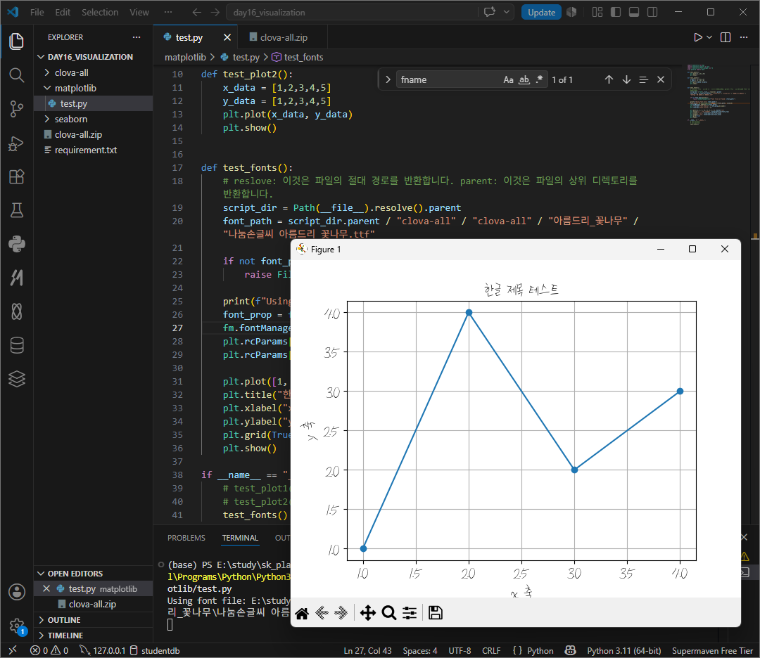
def test_fonts():
    # reslove: 이것은 파일의 절대 경로를 반환합니다. parent: 이것은 파일의 상위 디렉토리를 반환합니다.
    script_dir = Path(__file__).resolve().parent
    font_path = script_dir.parent / "clova-all" / "clova-all" / "아름드리_꽃나무" / "나눔손글씨 아름드리 꽃나무.ttf"

    if not font_path.exists():
        raise FileNotFoundError(f"Font file not found: {font_path}")

    print(f"Using font file: {font_path}")
    font_prop = fm.FontProperties(fname=str(font_path), size=18)
    fm.fontManager.addfont(str(font_path))
    plt.rcParams["font.family"] = font_prop.get_name()
    plt.rcParams["font.size"] = 16

    plt.plot([1, 2, 3, 4], [1, 4, 2, 3], marker="o")
    plt.title("한글 제목 테스트", fontproperties=font_prop)
    plt.xlabel("x 축", fontproperties=font_prop)
    plt.ylabel("y 축", fontproperties=font_prop)
    plt.grid(True)
    plt.show()
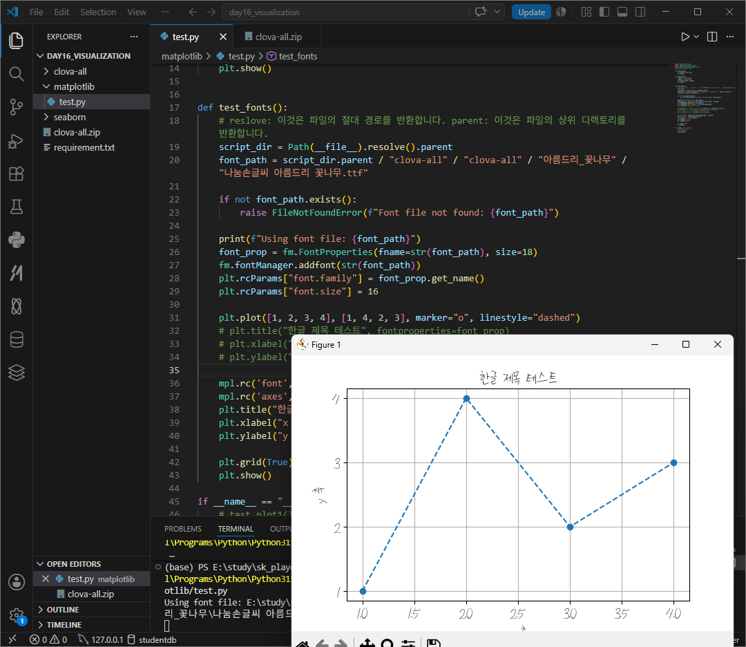
rc parameter
위처럼 객체마다 따로 설정할 수 있고, 전체에 적용할 수도 있다.

 plt.plot([1, 2, 3, 4], [1, 4, 2, 3], marker="o")
    # plt.title("한글 제목 테스트", fontproperties=font_prop)
    # plt.xlabel("x 축", fontproperties=font_prop)
    # plt.ylabel("y 축", fontproperties=font_prop)

    mpl.rc('font', family=font_prop.get_name(), size=16)
    mpl.rc('axes', unicode_minus=False)
    plt.title("한글 제목 테스트")
    plt.xlabel("x 축")
    plt.ylabel("y 축")
plot(~, linestyle = 'dashed")
스타일문자열은 color, marker, linestyle 순서로 지정한다.만약 일부 생략시 디폴트 값이 적용된다.
. 포인트마커
, 픽셀마커
o 서클마커
v ^ < > 아래 위 좌 우 화살표 마커
1, 2, 3, 4 tri 아래 위 좌 우 마커
s square 마커
p 팬타콘 마커
* 별모양 마커
h H 핵사곤 마 1 2
+ x 마커
D d 다이아몬드, 얇은 다이아몬드 마커

http://matplotlib.org/examples/color/named_colors.html
color example code: named_colors.py — Matplotlib 2.0.2 documentation
color example code: named_colors.py (Source code, png, pdf) """ ======================== Visualizing named colors ======================== Simple plot example with the named colors and its visual representation. """ from __future__ import division import m
matplotlib.org
선 스타일에는 -solid, --dashed, -.dotted, "dash-dit이 있따.
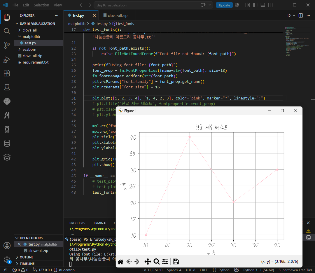
외에도 color c색, linewith lw선 굵기, linestyle ls 선스타일 marker 마커봉류, markersize ms 마커크기, markeredgecolor mec 마커 선 생, markeredgewidth mew 마커 선 굵기, markerfacecolor mfc 마커 내부 색깔이 있다.
https://matplotlib.org/stable/api/lines_api.html#matplotlib.lines.Line2D
matplotlib.lines — Matplotlib 3.10.9 documentation
matplotlib.lines 2D lines with support for a variety of line styles, markers, colors, etc. Classes Functions
matplotlib.org

plt.xlim(최소, 최대)
plt.ylim(최소, 최대)
x와 y푹의 최소값과 최댓값을 지정할 수 있다.

xticks yticks
축 표시 지점을 rick이라한다. 여기에 적힌 숫자 혹은 글자는 tick label이라한다. 이 라벨은 보통 matplotlib가 자동으로 정해주지만 수동으로 설정할 수도 있다 .
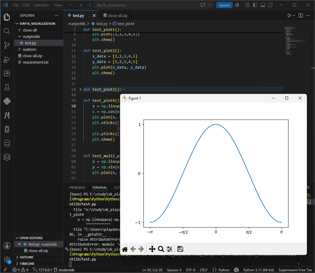
def test_plot4():
    x = np.linspace(-np.pi, np.pi, 100)
    c = np.cos(x)
    plt.plot(x, c)
    plt.xticks([-np.pi, -np.pi/2, 0, np.pi/2, np.pi],
               [r'$-\pi$', r'$-\pi/2$', r'$0$', r'$\pi/2$', r'$\pi$'])
    plt.yticks([-1, 0, 1], [r'$-1$', r'$0$', r'$1$'])
    plt.show()
scatter
산점도 점 그래프


def test_scatter():
    # x = np.linspace(0, 2 * np.pi, 100)
    x = np.random.rand(100)
    # y = np.sin(x)
    y = np.random.rand(100)
    plt.scatter(x, y)
    plt.show()
s_size 와 s_color를 지정해 scatter(x, y)에 속성을 추가하면 버블차트와 유사하게 보이게 할 수 있다 .

def test_scatter():
    # x = np.linspace(0, 2 * np.pi, 100)
    x = np.random.rand(100)
    # y = np.sin(x)
    y = np.random.rand(100)
    s_size = np.random.randint(10, 1000, size=100)
    s_color = np.random.rand(100)
    plt.scatter(x, y, s=s_size, c=s_color)
    plt.show()
plt.plot()를 여러개 작성하고 show()하면 다중 그래프가 생성된다.
legend설정시 범례가 그래프 내에 생성된다.

def test_multi_plot():
    x = np.linspace(0, 2 * np.pi, 100)
    y = np.sin(x)
    plt.plot(x, y)

    x = np.linspace(0, 2 * np.pi, 100)
    y = np.cos(x)
    plt.plot(x, y)
    plt.legend(["sin", "cos"])

    plt.show()
범례의 위치는 자동으로 정해지지만 수동으로 설정하고 싶다면 loc 인수를 설정한다.
best 0,
upper right 1, upper left 2,
lower left 3, lower right 4.
right 5
center left 6
center right 7
lower center 8
upper center 9, center 10
plt.legend(["sin", "cos"], loc = "upper right")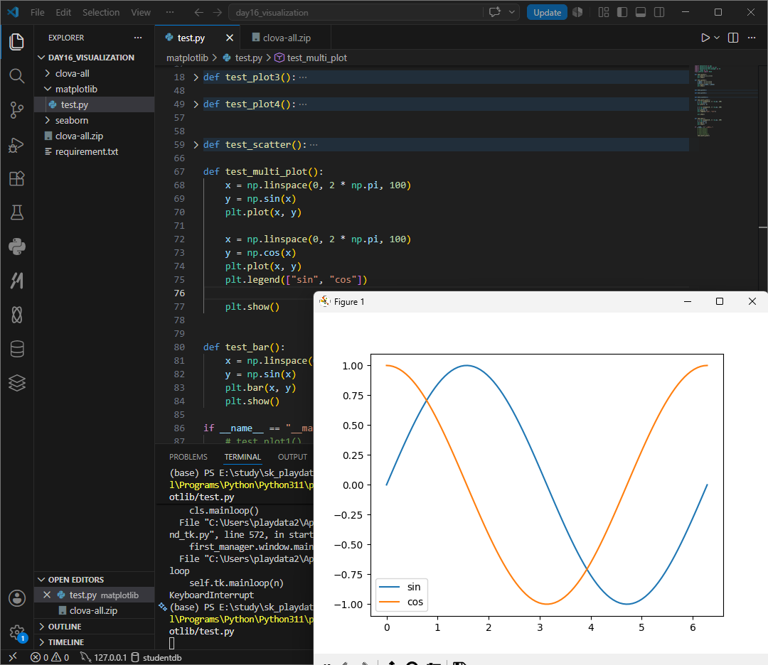
bar() barh() 세로, 가로막대


def test_bar():
    x = [3, 4, 5, 6, 7]
    y = [4, 5, 6, 7, 8]
    # plt.bar(x, y)
    plt.barh(x, y)
    plt.show()
colors나 hatches 객체를 만들어
plt.bar 할때 x, y, color = colors, hatch = hatches로 주면
각 막대마다 다른 색상, 패턴을 부여할 수 있다.

def test_bar():
    x = [3, 4, 5, 6, 7]
    y = [4, 5, 6, 7, 8]
    colors = ['red', 'blue', 'green', 'orange', 'purple']
    hatches = ['/', '\\', '|', '-', '+']
    # plt.bar(x, y)
    # plt.barh(x, y, alpha=0.5, xerr=2,color='orange',
    #         edgecolor='red')

    bars = plt.bar(x, y, color=colors, hatch=hatches)
    plt.show()
bar_label 그래프 축에 라벨 추가하기
gca 작업대상을 지목한다. get current axes 객체 주소 가져오기
bar_label 그래프 위에 라벨을 붙여준다. bar_label은 반드시 어떤 축 위에서 실행되어야하는 함수로 정석방식은 ax=plt.subplots()로 ax라는 방주소로 ax.bar_label()을 쓰나 gca() 방식으로 ax를 따로 만들지않고 '일단 지금 쓰고있는 객체'를 불러와 일을 시킬수있다.
ylim y축 눈금범위 조정. 글자가 잘리는것을 방지한다.

def test_bar():
    x = [3, 4, 5, 6, 7]
    y = [4, 5, 6, 7, 8]
    colors = ['red', 'blue', 'green', 'orange', 'purple']
    hatches = ['/', '\\', '|', '-', '+']
    # plt.bar(x, y)
    # plt.barh(x, y, alpha=0.5, xerr=2,color='orange',
    #         edgecolor='red')

    custom_labels = ["red", "blue", "green", "orange", "purple"]
    bars = plt.bar(x, y, color=colors, hatch=hatches)
    plt.gca().bar_label(bars, labels=custom_labels, padding=3)
    plt.ylim(0, 10)

    plt.show()
grid(False) 그리드 없애기

hist() 히스토그램

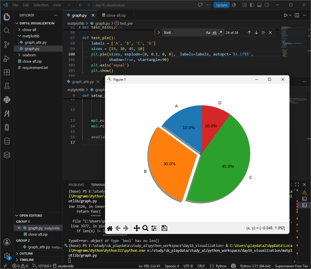
pie차트
autopct = '' 포맷팅 설정 가능
*퍼센트를 넣고싶을경우 %%두번 써야 적용된다.

def test_pie():
    labels = ['A', 'B', 'C', 'D']
    sizes = [15, 30, 45, 10]
    plt.pie(sizes, labels=labels, autopct='%1.1f%%')
    plt.axis('equal')
    plt.show()
figure
모든 그림을 Figure 객체이다.
정식으로 matplotlib.figure,figure클래스 객체에 포함되어있다.
원래 figure를 생성하려면 figure 명령을 사용해야하나 일반적인 plot명령 실행시 자동으로 figure를 생성해주기에 figure 명령을 잘 사용하지않는다.
figure를 사용하는 경우에는 여러개의 윈도우를 동시에 띄워야하거나 그림의 크기 figsize를 설정하고 싶을 때이다.

def test_hist():
    f1 = plt.figure(figsize=(3, 6))
    x = np.random.rand(100)
    plt.hist(x, bins=10)
    plt.show()
plt.subplots(행, 열)
그래프를 여러개를 그릴 수 있다.
gcf = 현재 사용중인 figure 객체를 얻을 수 있다.

def test_subplots():
    fig, axes = plt.subplots(2, 2, figsize=(8, 8))
    x = np.linspace(0, 2 * np.pi, 100)
    axes[0, 0].plot(x, np.sin(x))
    axes[0, 1].plot(x, np.cos(x))
    axes[1, 0].plot(x, np.cos(x))
    axes[1, 1].plot(x, np.sin(x))

    print(fig, id(fig))
    print(plt.gcf(), id(plt.gcf()))
    plt.show()
plt.tight_layout() 플롯간의 간격을 자동으로 맞춰준다.

def test_subplots():
    fig, axes = plt.subplots(2, 2, figsize=(8, 8))
    x = np.linspace(0, 2 * np.pi, 100)
    axes[0, 0].plot(x, np.sin(x))
    axes[0, 1].plot(x, np.cos(x))
    axes[1, 0].plot(x, np.cos(x))
    axes[1, 1].plot(x, np.sin(x))

    print(fig, id(fig))
    print(plt.gcf(), id(plt.gcf()))
    plt.tight_layout()
    plt.show()
twinx()
x축을 공유하는 새로운 axes 객체를 만든다.

alpha = 0
opacity 설정

xerr, yerr
에러바 추가
xerr와 yerr는 오차범위 error bar를 표시할때 사용한다. 데이터가 정확한값이 아니라 + - 오차가 존재할때 범위를 같이 표시한다.

stam plot
바 차트와 유사하지만 폭이 없는 그래프
주로 이산 확률 함수나 자기상관관계를 묘사할때 사용한다.

startangle
이란 원을 잘라 그리는 원형그래프가 몇도 위치부터 첫 조각을 시작할지를 결정하는것으로 시계방향으로 봤을때 0은 오른쪽 90은 위 180은 왼 270은 아래로 90 이 제일 많이 사용된다.
shadow 그림자 여부 설정

plt.pie(sizes, labels=labels, autopct='%1.1f%%',
            shadow=True, startangle=90)
explode = []
explode는 데이터의 갯수와 같아야하며 조각하나만, 전부 조금씩 튀어나오게 모두 가능하다. 1은 기본값
sklearn 머신러닝 라이브러리, 데엍를 가지고 예측, 분류, 군집화, 분석 등을 쉽게 해준다. 공부시간이 1시간일때 50점이고 공부 2시간이 60점이라면 공부 5시간일경우? 등의 점수예측이나 이 꽃이미지가 장미인가 튤립인가 등을 자동분류할 수 있다.
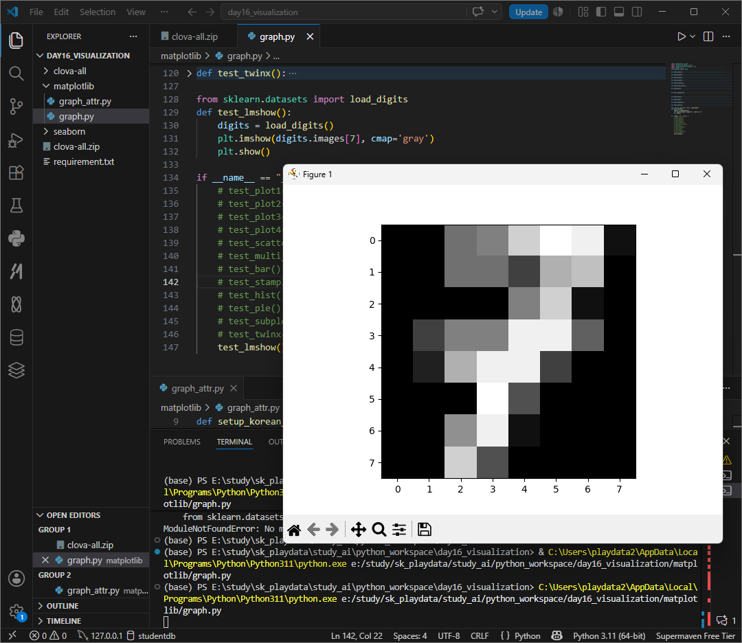
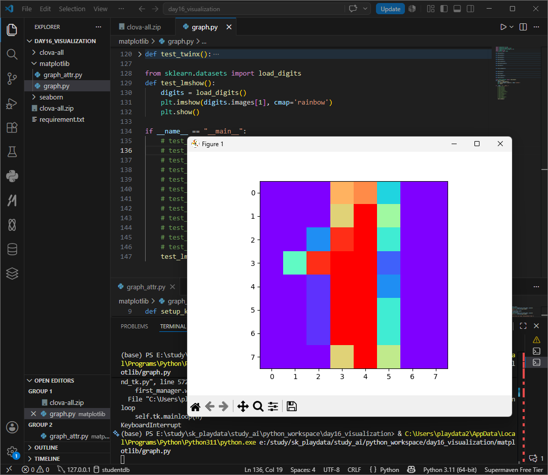
load_digits는 손글씨 숫자데이터셋으로 연습용 데이터 중 하나로 사람이 손으로 쓴 숫자 이미지를 모아둔 데이터이다 . 머신러닝이 이 그림이 숫자 몇인지 맞추는 연습용으로 많이 사용한다.
cmp는 colormap으로 미리 정해진 이름들이 있다. gray흑밸 ciridis 기본, plasma 보라~ 노랑, inferno 어두운 불꽃같은 느낌, magma 검정~ 보라, cividis 색약친화, jet 무지개, rainbow 무지개, cool 청록~ 분홍, hot 검정~ 빨강~노랑...
* jet과 raindow모두 무지개이나 jet이 좀더 진하다.
conda install scikit-learn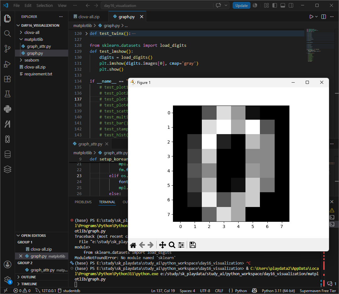

외의 colormap 정보는 아래 url을 확인하자.
https://matplotlib.org/stable/tutorials/colors/colormaps.html
https://matplotlib.org/stable/tutorials/colors/colormaps.html
matplotlib.org
interpolation
interpolation은 이미지 확대시 픽셀사이를 어떻게 채울지를 결정한다. 원본 이미지가 작으면 픽셀이 네모칸으로 보이게 되는데 이것을 확대할때 부드럽게 만들지, 픽셀 느낌을 유지할지드을 정하는것이 interpolation
nearest는 픽셀그대로, bilinear 부드럽게, bicubic 더 부드럽게 none 보간없음 등의 속성이 있다.
supported values are 'nearest', 'hanning', 'catrom', 'spline16', 'hermite', 'quadric', 'bicubic', 'hamming', 'blackman', 'auto', 'gaussian', 'none', 'spline36', 'mitchell', 'bilinear', 'sinc', 'kaiser', 'antialiased', 'lanczos', 'bessel'

from sklearn.datasets import load_digits
import matplotlib.pyplot as plt

def test_lmshow():
    digits = load_digits()
    plt.imshow(digits.images[1], cmap='jet', interpolation='bilinear')
    plt.show()

if __name__ == "__main__":
    test_lmshow()
contour
등고선 표시하기
contour는 등고선만, contourf는 색을 칠해준다.
등고선 그래프 contour는 2차원 평면 위의 각 좌표마다 높이값이 있어야 그릴 수 다. 즉 meshgrid로 모든 x, y 좌표 조합을 만들고 z가 x**2 + y**2라는 전제조건으로 생각하고 구현할 수 있겠다.
linespace -5 ~ 5사이를 100개로 균등하게 분할해서
x, y를 meshgrid로 2차원 좌표판으로 바꾼다.
각 좌표쌍이 만들어진다.


import matplotlib as mpl
import matplotlib.pyplot as plt
import numpy as np

def f(x, y):
    return x**2 + y**2

def test_contour():
    x = np.linspace(-5, 5, 100)
    y = np.linspace(-5, 5, 100)
    X, Y = np.meshgrid(x, y)
    Z = f(X, Y)
    # plt.contour(X, Y, Z)
    plt.contourf(X, Y, Z)
    plt.show()

if __name__ == "__main__":
    test_contour()
여기저기서 사용될 수 있는 언어설정은 함수로 작성해서 불러와 쓰는것이 좋다 .
함수 매개변수에 family내용을 선언해놓으면 기본값으로 설정된다.
한글폰트 적용시 - 마이너스 기호가 네모로 깨지는 경우가 있어
mpl.rc('axes', unicode_minus=False) 마이너스 깨짐을 방지한다.
기본폰트를 설정하고, 설치된 폰트 목록을 가져와 폰트가 설정되어있지않으면 폰트를 직접 사용하도록하며 이때 로컬 .ttf 파일의 존재를 확인한다.
FontProperties로 해당 ttf 파일을 폰트 객체로 생성해서 mpl.rcParams['font.family']에 추가해 전체 기본 폰트를 변경한다.
폰트가 없을때는 경고를 출력한다.
def setup_korean_font(
                perfer_family_name: str = "NanumGothic",
                local_font_path: str = "./clova-all/clova-all/아름드리_꽃나무/나눔손글씨 아름드리 꽃나무.ttf",
                local_bold_path: str = "./clova-all/clova-all/아름드리_꽃나무/나눔손글씨 아름드리 꽃나무.ttf"):
    mpl.rc('axes', unicode_minus=False)
    mpl.rc('font', family=perfer_family_name)

    available = set(f.name for f in fm.fontManager.ttflist)
    if perfer_family_name not in available:
        if os.path.exists(local_font_path):
            font_prop = fm.FontProperties(fname=local_font_path, size=16)
            mpl.rcParams["font.family"] = font_prop.get_name()
            mpl.rcParams["font.size"] = 16
            fm.fontManager.addfont(local_font_path)
        elif os.path.exists(local_bold_path):
            font_prop = fm.FontProperties(fname=local_bold_path, size=16)
            mpl.rcParams["font.family"] = font_prop.get_name()
        else:
            print("Warning: Preferred font not found. Using default font.")
annotate('글자', xy=(x값, y값), xytext=(txt가 위치할 좌표), arrowprops=dict(arrowstyle='->'))로 특정 데이터에 글자를 써 표시할 수 있다.
plt.text(x, y, 글자) x, y, 위치에 y1값을 글자로 표시할 수 있다. 이때 조건문등을 쓰면 강조효과가 있다.
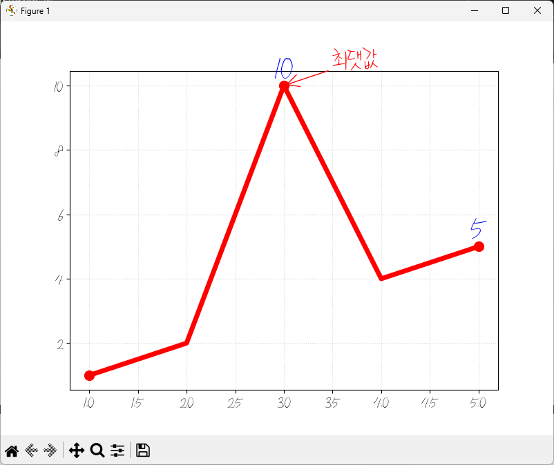
def test_line_detail():
    setup_korean_font()
    x = list(range(1, 6))
    y = [1, 2, 10, 4, 5]

    plt.figure(figsize=(8, 6))
    plt.plot(x, y, color='red', linewidth=5, marker='o', markersize=10, markevery=2)

    max_idx = max(range(len(y)), key=lambda i: y[i])
    max_x, max_y = x[max_idx], y[max_idx]
    plt.annotate('최댓값', xy=(max_x, max_y), xytext=(50, 20), color = 'red',
                 fontweight = 'bold', fontsize = 32, textcoords='offset points',
                 arrowprops=dict(arrowstyle='->', color='red'))

    for xi, yi in zip(x, y):
        if yi > 4:
            plt.text(xi, yi, f'{yi}', ha='center', va='bottom', color='blue', fontweight='bold', fontsize=32)
    plt.grid(True, linestyle = ":", alpha = 0.5)

    plt.show()
surface()
이 기괴한 그래프는 2D 평면이 아닌 그물망 mesh를 씌운 3d 지형도이다.
surface, 표면을 그리는 함수로 격자모양의 바닥 xx, yy위에 높이값 zz를 얹어 그 점들을 서로 연결해 하나의 내끈한 면으로 만든다.
meshgrid로 가로세로 격자무늬를 그려 모눈종이를 만들고
rr = mp.sqrt(xx2 + yy2)로 0.0에서 각 격점까지 거리를 계산해
zz = np.sin(rr) 거리에 따라 높이를 sin함수로 결정했다 .sin, 멀어질수록 출렁이는 물결모양.
plot_surface는 이 높이값들을 연결해서 입체적인 천을 덮는것이다.
rstride, castride는 그물망의 간격으로 1이면 아주 촘촘하게, 값을 크게하면 듬성듬성해져 각진 모양이 나온다. antialiased=false를 설정하면 선이 더 날카로워지며
마우스로 돌려보며 각도마다의 모습을 확인할 수 있지만 ax.view_init(elev=30, axim=45) 코드를 실행해 코드에서 처음각도를 정해줄 수 있다.

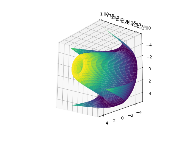

def test_surface():
    x = np.arange(-5, 5, 0.25)
    y = np.arange(-5, 5, 0.25)
    xx, yy = np.meshgrid(x, y)
    rr = np.sqrt(xx**2 + yy**2)
    zz = np.sin(rr)

    fig = plt.figure()
    # ax = Axes3D(fig)
    ax = fig.add_subplot(111, projection='3d')

    ax.plot_surface(xx, yy, zz, rstride=1, cstride=1, cmap='viridis')
    plt.show()
plot_surface가 면을 덮는 방식이라면, wireframe은 철사로 만든 뼈대를 보여주는 방식이다.
3차원 공간의 점들을 선으로만 연결한 그래프로 마치 건물을 짓기전에 철근뼈대를 세운것과 같은 모습이다.
rstride, cstride가 1일경우 매우촘촘해지며 수가 커질수록 그물이 듬성듬성해진다.
와이어프레임은 데이터가 너무 많을때 rstride값을 키워주면 그래프가 훨씬 깔끔하고 보기 편해진다.

def test_wireframe():
    x = np.arange(-5, 5, 0.25)
    y = np.arange(-5, 5, 0.25)
    xx, yy = np.meshgrid(x, y)
    rr = np.sqrt(xx**2 + yy**2)
    zz = np.sin(rr)

    fig = plt.figure()
    ax = fig.add_subplot(111, projection='3d')
    ax.plot_wireframe(xx, yy, zz, rstride=1, cstride=1, cmap='viridis')
    plt.show()
triangular grid
matplotlib 버전 1.3부터 삼각 그리드에 대한 지원이 추가되었다.
앞서 본 surface 그래프는 grid기반으로 면을 채웠다면 트라이앵귤레이션은 점들을 삼각형 단위로 쪼개서 연결한다. 어떤 복잡한 지형이나 흩어진 점들이라고 삼각형 3개를 연결하면 완벽한 평면을 만들 수 있다. 이는 지도상의 무작위 측정 지점등의 시각화할때 강력하다.
앞서서 게속 활용했던 x, y, rr, zz에서 fig, ax부분만 triangulation으로 바꿔보자.
특정 그래프를 이를 1차원으로 펴서 보여준다고 생각하면좋다.

def test_triangulation():
    x = np.arange(-5, 5, 0.25)
    y = np.arange(-5, 5, 0.25)
    xx, yy = np.meshgrid(x, y)
    rr = np.sqrt(xx**2 + yy**2)
    zz = np.sin(rr)

    tri = Triangulation(xx.flatten(), yy.flatten())

    plt.tripcolor(tri, zz.flatten(), cmap='viridis')
    plt.show()
위 surface wireframe과 triangulation은 표현방식만 다를뿐 사실 비슷해보인다.
이것을 한꺼번에 확인할 수도 있을까?
plot_trisurf, 삼각형 조각들을 입체적으로 이어붙여 3d표면을 만들고,
tricontourf 입체데이터를 수직으로 꾸구 눌러 2d 색상 지도를 만든다.
offset옵션을 통해 바닥에 붙여준다 .
그냥 trisurf, 입체만 있으면 어느지점이 정확히 어떤 좌표인지 헷갈릴수있어 등고선 지도가 깔려있으면 좌료를 읽기 편해진다 .
두함수에 tri가 들어가는데 이는 triangulation알고리즘을 기반으로 하기 때문이다.

import matplotlib.pyplot as plt
import numpy as np
from matplotlib import cm

def test_surface_with_tri_bottom():
    x = np.arange(-3, 3, 0.3)
    y = np.arange(-3, 3, 0.3)
    xx, yy = np.meshgrid(x, y)
    xf, yf = xx.flatten(), yy.flatten()
    zf = np.cos(xf) * np.cos(yf)

    fig = plt.figure(figsize=(10, 8))
    ax = fig.add_subplot(111, projection='3d')

    ax.plot_trisurf(xf, yf, zf, cmap=cm.jet)

    ax.tricontourf(xf, yf, zf, zdir='z', offset=-1.5, cmap=cm.jet, alpha=0.5)

    ax.set_zlim(-1.5, 1)    #
    ax.view_init(30, -45)

    plt.show()

if __name__ == "__main__":
    test_surface_with_tri_bottom()
수령받은 코드를 이해해보자.
seaborn에서 tips 데이터를 가져와 구현한 각 그래프를 이해해보자.
관계형
replot(x, y, data) 기본형, 기본값 scatter 전체 금액에 따라 팁이 어떻게 변하는지 scatter로 보여주고있다.

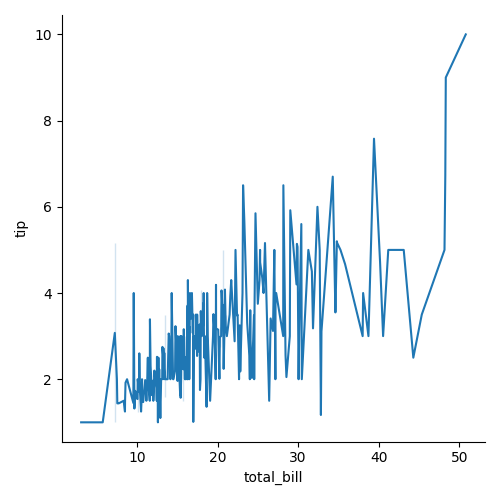
replot(x, y, kind='line', data) 선그래프, 금액에 따른 변화추이를 부드럽게 연결해 보여주고있다.
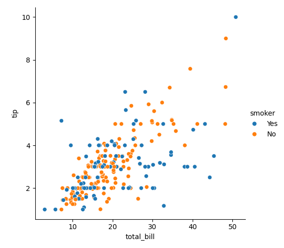
replot(x, y, hue='smoker', data) 기존 scatter 형식에서 흡연여부를 추가해 이에 따라 점의 색상을 다르게 칠해서 흡연자와 비흡연자 사이 팁주는 연관관계를 보여주고있다 .
쌍관계
데이터셋에 있는 여러 숫자형 변수들을 한꺼번에 짝지어 비교한다.
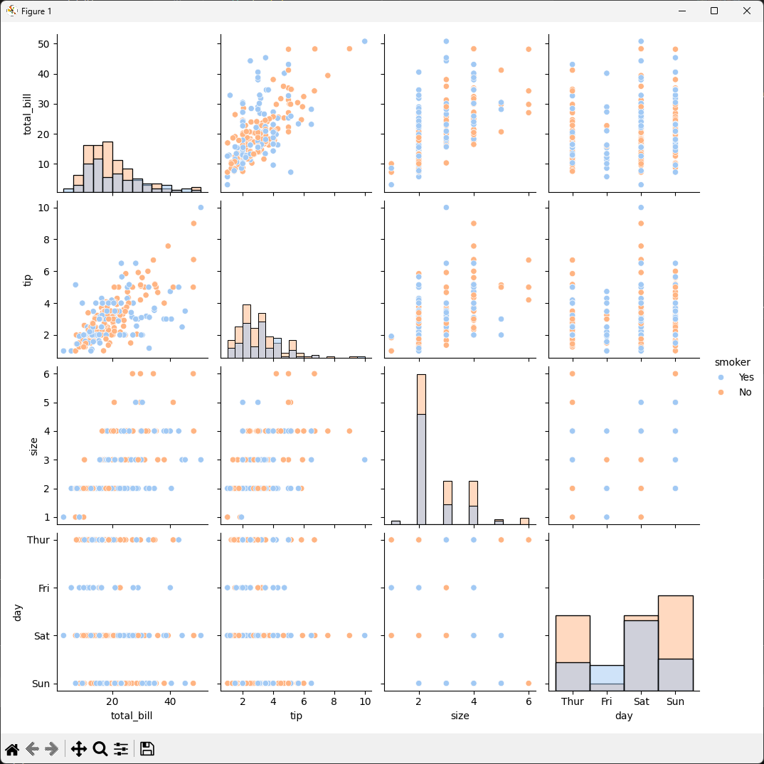
pairplot(data) 대각선은 히스토그램, 외에는 scatter로 이루어져있다. 모든 숫자 열을 서로 비교해 대각선은 자기자신의 분포, 나머지는 두변수의 관계를보여준다.


pairplot(data, vars), pairplot(data, y_vars, x_vars) x_vars와 y_vars를 써서 내가 보고싶은 열들만 골라내 데이터가 너무 많아 그래프가 복잡해지는것을 막아준다.

pairplot(data, vars, kind='scatter', diag_kind='hist', palette='pastel') diag_kind를 사용해 그래프 모양을 바꾸고, palette를 사용해 색감을 조정한다.
이때 hue='smoker'와 같이 '그룹을 나누는 기준'이 있어야 적용되고 아닐경우엔 seaborn이 하나의 색으로 그려 차이를 알기 어렵다.
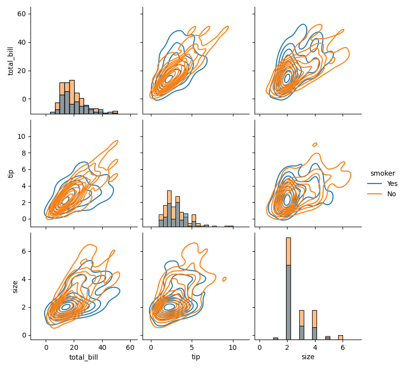
pairplot(data, kind='kde', diag_kind='hist', hue='smoker') 점 대신 밀도 등고선으로 관계를 보여주고 흡연여부를 hue를 섞어 분석적인 그림을 만들었다.
pivot_table(values, index, columns, aggfunc), heatmap(pivot_table, annot, cmap)요일, 시간대별로 평균 팁이 얼마인지 요약해 표로 만든 뒤 색을 입혔다. annot=true는 칸 안에 실제 숫자를 써주는 옵션이다.

heatmap(columns.corr, nnot=true, cmap) 상관계수 correlation 시각화. 두변수가 얼마나 서로 밀접하게 관련되어있는지를 -1 ~ 1 사이의 숫자로 보여주되 coolwarm cmap으로 양수는 빨강, 음수는 파랑으로 표시했다.

import seaborn as sns
import matplotlib.pyplot as plt

tips = sns.load_dataset("tips")

def test1():
    sns.relplot(x='total_bill', y='tip', data=tips)
    plt.show( )

def test2():
    sns.relplot(x='total_bill', y='tip',  kind='line', data=tips)
    plt.show( )

def test3():
    sns.relplot(x="total_bill", y="tip", hue="smoker", data=tips)
    plt.show( )

def test4():
    sns.pairplot(data=tips)
    # 대각선은 histogram, 그 외에는 scatter
    plt.show( )

def test5():
    sns.pairplot(tips, vars=['total_bill', 'tip', 'size', 'day'])
    plt.show( )

def test6():
    sns.pairplot(tips, y_vars=['total_bill', 'tip', 'day'], x_vars=['total_bill', 'tip'])
    plt.show( )

def test7():
    sns.pairplot(tips, vars=['total_bill', 'tip', 'size', 'day'], kind='scatter',
        diag_kind='hist',
        hue='smoker',
        palette='pastel')
    plt.show( )

def test8():
    sns.pairplot(tips, kind='kde', diag_kind='hist', hue='smoker')
    plt.show( )

def test9():
    pivot_table = tips.pivot_table(values='tip', index='day', columns='time',
                                   aggfunc='mean')
    sns.heatmap(pivot_table, annot=True, cmap='YlGnBu', linewidths=0.5)
    plt.show( )

def test10():
    selected_columns = tips[['total_bill', 'tip']]
    corr = selected_columns.corr( )
    sns.heatmap(corr, annot=True, cmap='coolwarm', linewidths=0.5)
    plt.show( )


if __name__ == '__main__':
    test1()
    test2()
    test3()
    test4()
    test5()
    test6()
    test7()
    test8()
    test9()
    test10()
다음 수령자료 seaborn_test2.py를 분석해보자.
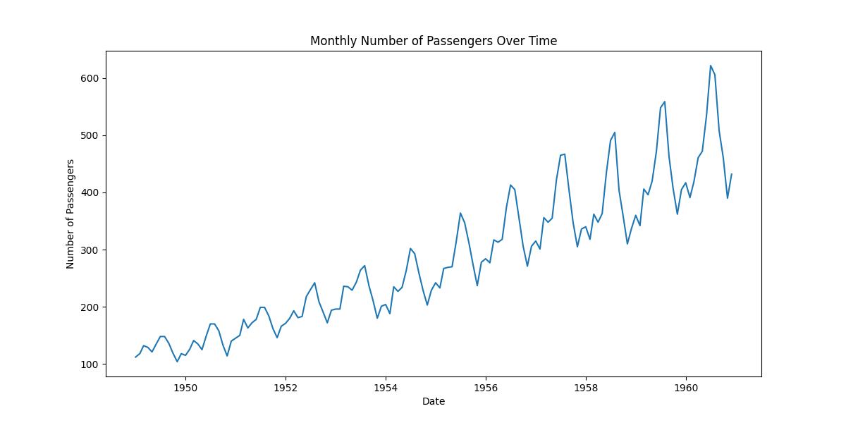
아래의 test1, test2, test3 과정은 lineplot(x, y, data) , lineplot(x, y, data) , heatmap(data)로 데이터가 각각
lineplot(x, y, data) 같은 연도에 여러달의 데이터가 들어있을 경우 seaborn의 lineplot는 자동으로 평균선을 그리고 그 주변에 신뢰구간인 흐릿한 영역을 표시해준다.

lineplot(x, y, data) 년과 월을 합쳐 완전한 날짜데이터를 만들어 year만 썼던 test1과 다르게 열두달의 모든 데이터의 움직임이 그래프에 다 나타난다, 시계열 데이터
위에서 시계열데이터를 완성했으니 다른 그래프로 그려보자.
heatmap(data, annot=True, fmt='d') groupby .sum().unstack()을 사용해 가로축은 연도, 세로축은 월이 되도록 표를 만들어 히트맵으로 구현해 여름휴가시즌인 7~8월에 승객이 가장 많이 몰려 진하게 나오는것을 확인할 수있다.

csv파일에 데이터 불러와 csv 읽기

숫자인 컬럼만 뽑아내기
def get_numeric_columns(df):
    numeric_cols = df.select_dtypes(include=['number']).columns
    print("Numeric columns:", numeric_cols)
    return numeric_cols
이 numeric한 cols만 모아
count를 구하고
6*4로 count개 subplots를 그려본다.
ax와 col을 zip형태로 histplot로 그린다. bins는 10으로 지정.
def test_dataframe_hist_subplot(df):
    numeric_cols = get_numeric_columns(df)
    col_count = len(numeric_cols)
    fig, axes = plt.subplots(col_count, 1, figsize=(6, 4 * col_count))
    if col_count == 1:
        axes = [axes]
    for ax, col in zip(axes, numeric_cols):
        sns.histplot(df[col], ax=ax, bins=10)
        ax.set_title(f'{col} Histogram')
        ax.set_xlabel(col)
        ax.set_ylabel('Count')
    plt.tight_layout()
    plt.show()
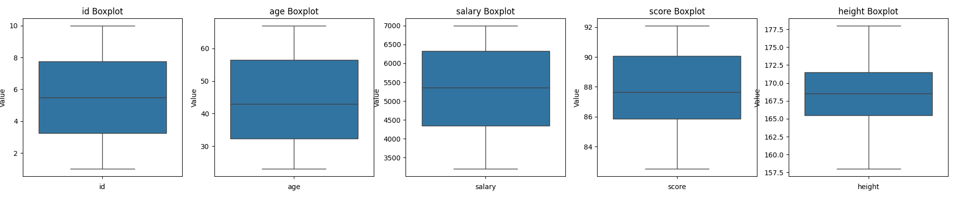
이번에는 가로정렬으로, boxplot형태로 그려보자.
def test_dataframe_boxplot_subplot(df):
    numeric_cols = get_numeric_columns(df)
    col_count = len(numeric_cols)
    fig, axes = plt.subplots(1, col_count, figsize=(5 * col_count, 4))
    if col_count == 1:
        axes = [axes]
    for ax, col in zip(axes, numeric_cols):
        sns.boxplot(df[col], ax=ax)
        ax.set_title(f'{col} Boxplot')
        ax.set_xlabel(col)
        ax.set_ylabel('Value')
    plt.tight_layout()
    plt.show()
이번에는 카테고리를 받아와 groupby해 mean평균을 구해 bar형으로 출력해보자.

salary값이 유독 너무 커 다른 값들의 표현이 보이지 않으니 secondary_y를 사용해보자.

def test_dataframe_groupby_subplot(df, category_col):
    numeric_cols = get_numeric_columns(df)
    grouped = df.groupby(category_col)[numeric_cols].mean()
    # grouped.plot(kind='bar', figsize=(8, 6))

    grouped.plot(
        kind='bar',
        figsize=(8, 6),
        secondary_y='salary'
    )

    plt.show()
'SK 네트웍스 AI 캠프' 카테고리의 다른 글
| SK 네트웍스 AI 캠프 - 2 _데이터 분석과 머신러닝 / 딥러닝 - Day18_머신러닝_회귀모델_분류모델 (0) | 2026.05.28 |
|---|---|
| SK 네트웍스 AI 캠프 - 2 _데이터 분석과 머신러닝 / 딥러닝 - Day17_머신러닝 학습방법과 데이터 관리 (0) | 2026.05.27 |
| [SK네트웍스 Family AI 캠프] 32기 4주차 회고: Day13 ~ Day15 (0) | 2026.05.22 |
| SK 네트웍스 AI 캠프 - 2 _데이터 분석과 머신러닝 / 딥러닝 - Day15_데이터 전처리 (0) | 2026.05.22 |
| SK 네트웍스 AI 캠프 - 2 _데이터 분석과 머신러닝 / 딥러닝 - Day14_데이터 전처리 (0) | 2026.05.21 |


