bootstrap을 통해 본인만의 stylesheet를 소유해보자.
Bootstrap에 접속해 cdn 코드를 복붙한다.
Bootstrap
Powerful, extensible, and feature-packed frontend toolkit. Build and customize with Sass, utilize prebuilt grid system and components, and bring projects to life with powerful JavaScript plugins.
getbootstrap.com
<!DOCTYPE html>
<html lang="en">
<head>
    <meta charset="UTF-8">
    <meta name="viewport" content="width=device-width, initial-scale=1.0">
    <title>Document</title>
    <link href="https://cdn.jsdelivr.net/npm/bootstrap@5.3.2/dist/css/bootstrap.min.css" rel="stylesheet" integrity="sha384-T3c6CoIi6uLrA9TneNEoa7RxnatzjcDSCmG1MXxSR1GAsXEV/Dwwykc2MPK8M2HN" crossorigin="anonymous">
</head>
<body>


    <script src="https://cdn.jsdelivr.net/npm/bootstrap@5.3.2/dist/js/bootstrap.bundle.min.js" integrity="sha384-C6RzsynM9kWDrMNeT87bh95OGNyZPhcTNXj1NW7RuBCsyN/o0jlpcV8Qyq46cDfL" crossorigin="anonymous"></script>
</body>
</html>

custom할 css와 js를 세팅한다.
<!DOCTYPE html>
<html lang="en">
<head>
    <meta charset="UTF-8">
    <meta name="viewport" content="width=device-width, initial-scale=1.0">
    <title>Document</title>
    <link href="https://cdn.jsdelivr.net/npm/bootstrap@5.3.2/dist/css/bootstrap.min.css" rel="stylesheet" integrity="sha384-T3c6CoIi6uLrA9TneNEoa7RxnatzjcDSCmG1MXxSR1GAsXEV/Dwwykc2MPK8M2HN" crossorigin="anonymous">
    <link rel="stylesheet" href="stylesheet.css">
</head>
<body>


    <script src="https://cdn.jsdelivr.net/npm/bootstrap@5.3.2/dist/js/bootstrap.bundle.min.js" integrity="sha384-C6RzsynM9kWDrMNeT87bh95OGNyZPhcTNXj1NW7RuBCsyN/o0jlpcV8Qyq46cDfL" crossorigin="anonymous"></script>
    <script src="stylesheet.js"></script>
</body>
</html>
bootstrap docs에서 사용할법한 - 원하는 - 레이아웃을 가져온다.
https://getbootstrap.com/docs/5.3/layout/containers/
Containers
Containers are a fundamental building block of Bootstrap that contain, pad, and align your content within a given device or viewport.
getbootstrap.com

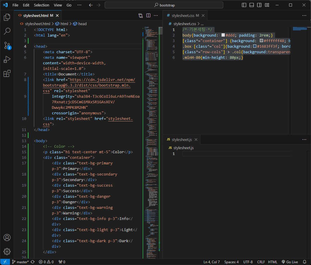
적절히 css를 지정해 보기좋게 만들어놓자.
/* 기본세팅 */
body{background: #ddd; padding: 2rem;}
[class^="container"] {background: #ffffff48; border: 1px solid white;}
.box [class^="col"]{background:#1683ff3f; border: 1px solid #0f7fff;}
[class^="row-cols"] > .col{background:transparent; border: 1px solid transparent;}
.minH-80{min-height: 80px;}
<!DOCTYPE html>
<html lang="en">
<head>
<meta charset="UTF-8">
<meta name="viewport" content="width=device-width, initial-scale=1.0">
<title>Document</title>
<link href="https://cdn.jsdelivr.net/npm/bootstrap@5.3.2/dist/css/bootstrap.min.css" rel="stylesheet"
integrity="sha384-T3c6CoIi6uLrA9TneNEoa7RxnatzjcDSCmG1MXxSR1GAsXEV/Dwwykc2MPK8M2HN" crossorigin="anonymous">
<link rel="stylesheet" href="stylesheet.css">
</head>
<body>
<!-- Color -->
<p class="h1 text-center mt-5">Color</p>
<div class="container">
<div class="text-bg-primary p-3">Primary</div>
<div class="text-bg-secondary p-3">Secondary</div>
<div class="text-bg-success p-3">Success</div>
<div class="text-bg-danger p-3">Danger</div>
<div class="text-bg-warning p-3">Warning</div>
<div class="text-bg-info p-3">Info</div>
<div class="text-bg-light p-3">Light</div>
<div class="text-bg-dark p-3">Dark</div>
</div>
<!-- Container -->
<p class="h1 text-center mt-5">Container</p>
<div class="container">기본</div>
<div class="container-sm">s 화면까지 100%</div>
<div class="container-md">m 화면까지 100%</div>
<div class="container-lg">l 화면까지 100%</div>
<div class="container-xl">xl 화면까지 100%</div>
<div class="container-xxl">xxl 화면까지 100%</div>
<div class="container-fluid">full배너 100vw</div>
<!-- grid -->
<p class="h1 text-center mt-5">Grid</p>
<div class="box">
<div class="container text-center">
<div class="row">
<div class="col">기본 col</div>
<div class="col-3">수치지정 col-3</div>
<div class="col-md-auto">가변 col</div>
</div>
<div class="row">
<div class="col col-sm-6">view값에따른 수치지정 col-sm-6</div>
</div>
</div>
</div>
<!-- Columns -->
<p class="h1 text-center mt-5">Columns</p>
<div class="box">
<div class="container text-center">
<div class="row">
<div class="col">첫번째, null</div>
<div class="col order-5">두번째, order-5</div>
<div class="col order-1">세번째, order-1</div>
</div>
</div>
<div class="container text-center">
<div class="row">
<div class="col order-last">첫번째, order-last</div>
<div class="col">두번째, null</div>
<div class="col order-first">세번째, order-1first</div>
</div>
</div>
<div class="container text-center">
<div class="row align-items-start minH-80">
<div class="col-3">col</div>
<div class="col-3">col</div>
<div class="w-100">줄바꿈시 .w-100</div>
<div class="col-3">col</div>
<div class="col-3">col</div>
</div>
</div>
<div class="container text-center">
<div class="row align-items-start minH-80">
<div class="col-12">정렬 - start</div>
</div>
</div>
<div class="container text-center">
<div class="row align-items-center minH-80">
<div class="col-12">정렬 - center</div>
</div>
</div>
<div class="container text-center">
<div class="row align-items-end minH-80">
<div class="col-12">정렬 - end</div>
</div>
</div>
<div class="container text-center">
<div class="row">
<div class="col-md-4 offset-md-2">왼쪽여백, offset-md-2</div>
</div>
</div>
<div class="container text-center">
<div class="row minH-80">
<div class="col align-self-start">정렬 - start</div>
<div class="col align-self-center">정렬 - center</div>
<div class="col align-self-end">정렬 - end</div>
</div>
</div>
<div class="container text-center">
<div class="row justify-content-start">
<div class="col-3 align-self-start">정렬 - start</div>
<div class="col-3 align-self-start">정렬 - start</div>
</div>
</div>
<div class="container text-center">
<div class="row justify-content-center">
<div class="col-3 align-self-center">정렬 - center</div>
<div class="col-3 align-self-center">정렬 - center</div>
</div>
</div>
<div class="container text-center">
<div class="row justify-content-end">
<div class="col-3 align-self-end">정렬 - end</div>
<div class="col-3 align-self-end">정렬 - end</div>
</div>
</div>
</div>
<!-- Shadow -->
<p class="h1 text-center mt-5">Shadow</p>
<div class="container">
<div class="shadow-sm p-3 mb-3 bg-body-tertiary rounded">그림자 s</div>
<div class="shadow p-3 mb-3 bg-body-tertiary rounded">그림자 m</div>
<div class="shadow-lg p-3 mb-3 bg-body-tertiary rounded">그림자 l</div>
</div>
<!-- Text -->
<p class="h1 text-center mt-5">Text</p>
<div class="container">
<h1 class="display-1">.display-1</h1>
<h1 class="display-2">.display-2</h1>
<h1 class="display-3">.display-3</h1>
<h1 class="display-4">.display-4</h1>
<h1 class="display-5">.display-5</h1>
<h1 class="display-6">.display-6</h1>
<h1>h1, 혹은 class .h1를 부여한다.</h1>
<h2>h2, 혹은 class .h2를 부여한다.</h2>
<h3>h3, 혹은 class .h3를 부여한다.</h3>
<h4>h4, 혹은 class .h4를 부여한다.</h4>
<h5>h5, 혹은 class .h5를 부여한다.</h5>
<h6>h6, 혹은 class .h6를 부여한다.</h6>
</div>
<div class="container">
<div class="vr"></div>
<br>
<abbr title="attribute">강한점선</abbr>, <abbr title="HyperText Markup Language" class="initialism">약한점선</abbr>
<br>
<mark>하이라이트</mark>
<br>
<a href="#">링크</a>
<a href="#" style="--bs-link-opacity: .5">투명도조절</a>
<br>
<code><code></code>표현, <kbd>keyboard</kbd>표현
<br>
게시판글 <span class="badge bg-secondary">new!</span>
<br>
<!-- Block level -->
<div class="row">
<div class="col-2 text-truncate">
This text is quite long, and will be truncated once displayed.
</div>
</div>
<!-- Inline level -->
<span class="d-inline-block text-truncate" style="max-width: 150px;">
This text is quite long, and will be truncated once displayed.
</span>
</div>
<!-- Hr -->
<p class="h1 text-center mt-5">Hr</p>
<div class="container">
<hr>
<hr class="border border-danger border-2 opacity-50">
</div>
<!-- Image -->
<p class="h1 text-center mt-5">Image</p>
<div class="container">
<img src="https://via.placeholder.com/1500x90?text=img-fluid" class="img-fluid">
<img src="https://via.placeholder.com/100x50?text=img-thumbnail" class="img-thumbnail">
<img src="https://via.placeholder.com/100x50?text=rounded" class="rounded">
<br>
<figure class="figure">
<img src="https://via.placeholder.com/1000x100?text=caption" class="figure-img img-fluid rounded" alt="...">
<figcaption class="figure-caption text-end">caption 달기가능</figcaption>
</figure>
</div>
<!-- Clearfix -->
<p class="h1 text-center mt-5">Clearfix</p>
<div class="container">
<div class="clearfix">
<img src="https://via.placeholder.com/150" class="col-md-2 float-md-end ms-md-3" alt="...">
<p class="text-secondary">
As you can see the paragraphs gracefully wrap around the floated image. Now imagine how this would look
with some actual content in here, rather than just this boring placeholder text that goes on and on, but
actually conveys no tangible information at. It simply takes up space and should not really be read.
</p>
<p class="text-center">.clearfix 하나로 img+txt pc/mobile 정렬을 완성한다.</p>
<p class="text-secondary">
And yet, here you are, still persevering in reading this placeholder text, hoping for some more
insights, or some hidden easter egg of content. A joke, perhaps. Unfortunately, there's none of that
here.
</p>
</div>
</div>
<!-- Table -->
<p class="h1 text-center mt-5">Table</p>
<div class="container">
<table class="table table-sm table-borderless">
<thead>
<tr>
<th scope="col" colspan="4" class="text-center">borderless table</th>
</tr>
</thead>
<tbody>
<tr>
<th scope="row">lorem</th>
<td>lorem</td>
<td>lorem</td>
<td>lorem</td>
</tr>
<tr>
<th scope="row">lorem</th>
<td>lorem</td>
<td>lorem</td>
<td>lorem</td>
</tr>
</tbody>
</table>
<table class="table table-sm table-bordered border-primary">
<thead>
<tr>
<th scope="col" colspan="4" class="text-center">bordered table</th>
</tr>
</thead>
<tbody>
<tr>
<th scope="row">lorem</th>
<td>lorem</td>
<td>lorem</td>
<td>lorem</td>
</tr>
<tr>
<th scope="row">lorem</th>
<td>lorem</td>
<td>lorem</td>
<td>lorem</td>
</tr>
</tbody>
</table>
<table class="table table-sm">
<caption><small>* caption달기 가능</small></caption>
<thead>
<tr>
<th scope="col" colspan="4" class="text-center">기본 table</th>
</tr>
</thead>
<tbody>
<tr>
<th scope="row">lorem</th>
<td>lorem</td>
<td>lorem</td>
<td>lorem</td>
</tr>
<tr>
<th scope="row">lorem</th>
<td>lorem</td>
<td>lorem</td>
<td>lorem</td>
</tr>
</tbody>
</table>
<table class="table table-sm">
<thead>
<tr>
<th scope="col" colspan="4" class="text-center">divider table</th>
</tr>
</thead>
<tbody class="table-group-divider">
<tr>
<th scope="row">lorem</th>
<td>lorem</td>
<td>lorem</td>
<td>lorem</td>
</tr>
<tr>
<th scope="row">lorem</th>
<td>lorem</td>
<td>lorem</td>
<td>lorem</td>
</tr>
</tbody>
</table>
<table class="table table-sm table-striped">
<thead>
<tr>
<th scope="col" colspan="4" class="text-center">striped table</th>
</tr>
</thead>
<tbody>
<tr>
<th scope="row">lorem</th>
<td>lorem</td>
<td>lorem</td>
<td>lorem</td>
</tr>
<tr>
<th scope="row">lorem</th>
<td>lorem</td>
<td>lorem</td>
<td>lorem</td>
</tr>
<tr>
<th scope="row">lorem</th>
<td>lorem</td>
<td>lorem</td>
<td>lorem</td>
</tr>
</tbody>
</table>
<table class="table table-sm table-dark table-striped">
<thead>
<tr>
<th scope="col" colspan="4" class="text-center">dark,striped table</th>
</tr>
</thead>
<tbody>
<tr>
<th scope="row">lorem</th>
<td>lorem</td>
<td>lorem</td>
<td>lorem</td>
</tr>
<tr>
<th scope="row">lorem</th>
<td>lorem</td>
<td>lorem</td>
<td>lorem</td>
</tr>
</tbody>
</table>
<table class="table table-sm table-success table-striped">
<thead>
<tr>
<th scope="col" colspan="4" class="text-center">success,striped table</th>
</tr>
</thead>
<tbody>
<tr>
<th scope="row">lorem</th>
<td>lorem</td>
<td>lorem</td>
<td>lorem</td>
</tr>
<tr>
<th scope="row">lorem</th>
<td>lorem</td>
<td>lorem</td>
<td>lorem</td>
</tr>
</tbody>
</table>
<table class="table table-sm table-hover">
<thead>
<tr>
<th scope="col" colspan="4" class="text-center">hover가 가능한 table</th>
</tr>
</thead>
<tbody>
<tr>
<th scope="row">lorem</th>
<td>lorem</td>
<td>lorem</td>
<td>lorem</td>
</tr>
<tr>
<th scope="row">lorem</th>
<td>lorem</td>
<td>lorem</td>
<td>lorem</td>
</tr>
</tbody>
</table>
</div>
<!-- Form -->
<p class="h1 text-center mt-5">Form</p>
<div class="container">
<input class="form-control">
<input class="form-control form-control-sm" type="text" placeholder=".form-control-sm"
aria-label=".form-control-sm example">
<input class="form-control" id="disabledInput" type="text" placeholder="Disabled" disabled>
<div class="form-floating">
<input type="email" class="form-control" id="floatingInput" placeholder="name@example.com">
<label for="floatingInput">caption이 가능하다.</label>
</div>
<textarea class="form-control" id="exampleFormControlTextarea1" rows="3">textarea</textarea>
<input type="color" class="form-control form-control-color" id="exampleColorInput" value="#563d7c"title="Choose your color">
<input class="form-control form-control-sm" id="formFileSm" type="file">
<div class="input-group mb-3">
<input type="file" class="form-control" id="inputGroupFile02">
<label class="input-group-text" for="inputGroupFile02">업로드</label>
</div>
<div class="input-group">
<span class="input-group-text" id="basic-addon1">Hi!</span>
<input type="text" class="form-control" placeholder="input-group Form" aria-label="Username"
aria-describedby="basic-addon1">
</div>
<div class="input-group">
<span class="input-group-text">성/이름 순으로 입력하세요</span>
<input type="text" aria-label="First name" class="form-control">
<input type="text" aria-label="Last name" class="form-control">
</div>
<div class="input-group">
<span class="input-group-text">$</span>
<span class="input-group-text">0.00</span>
<input type="text" class="form-control" aria-label="Dollar amount (with dot and two decimal places)">
</div>
<div class="input-group">
<input type="text" class="form-control" aria-label="Dollar amount (with dot and two decimal places)">
<span class="input-group-text">$</span>
<span class="input-group-text">0.00</span>
</div>
<br>
<div class="input-group">
<input type="text" class="form-control" placeholder="버튼 + input" aria-label="버튼 + input"
aria-describedby="button-addon2">
<button class="btn btn-outline-secondary" type="button" id="button-addon2">버튼</button>
</div>
<div class="input-group">
<input type="text" class="form-control" aria-label="Text input with dropdown button">
<button class="btn btn-outline-secondary dropdown-toggle" type="button" data-bs-toggle="dropdown"
aria-expanded="false">드롭다운</button>
<ul class="dropdown-menu dropdown-menu-end">
<li><a class="dropdown-item" href="#">Action</a></li>
<li><a class="dropdown-item" href="#">Another action</a></li>
<li><a class="dropdown-item" href="#">Something else here</a></li>
<li>
<hr class="dropdown-divider">
</li>
<li><a class="dropdown-item" href="#">Separated link</a></li>
</ul>
</div>
<div class="input-group">
<input type="text" class="form-control" aria-label="Text input with segmented dropdown button">
<button type="button" class="btn btn-outline-secondary">버튼</button>
<button type="button" class="btn btn-outline-secondary dropdown-toggle dropdown-toggle-split"
data-bs-toggle="dropdown" aria-expanded="false">
<span class="visually-hidden">드롭다운</span>
</button>
<ul class="dropdown-menu dropdown-menu-end">
<li><a class="dropdown-item" href="#">Action</a></li>
<li><a class="dropdown-item" href="#">Another action</a></li>
<li><a class="dropdown-item" href="#">Something else here</a></li>
<li>
<hr class="dropdown-divider">
</li>
<li><a class="dropdown-item" href="#">Separated link</a></li>
</ul>
</div>
</div>
<div class="container">
<input class="form-control form-control-sm" list="datalistOptions" id="exampleDataList"
placeholder="추천검색어 datalist">
<datalist id="datalistOptions">
<option value="데이터1"></option>
<option value="데이터2"></option>
<option value="데이터3"></option>
<option value="데이터4"></option>
<option value="데이터5"></option>
</datalist>
</div>
<div class="container">
<select class="form-select form-select-sm" aria-label="Default select example">
<option selected>select</option>
<option value="1">One</option>
<option value="2">Two</option>
<option value="3">Three</option>
</select>
<select class="form-select form-select-sm" multiple aria-label="Multiple select example">
<option selected>select 여러개고르기</option>
<option value="1">One</option>
<option value="2">Two</option>
<option value="3">Three</option>
</select>
</div>
<div class="container">
<div class="form-check">
<input class="form-check-input" type="checkbox" value="" id="flexCheckDefault">
<label class="form-check-label" for="flexCheckDefault">
기본 checkbox
</label>
</div>
<div class="form-check">
<input class="form-check-input" type="checkbox" value="" id="flexCheckIndeterminate">
<label class="form-check-label" for="flexCheckIndeterminate">
- checkbox
</label>
</div>
<div class="form-check">
<input class="form-check-input" type="radio" name="flexRadioDefault" id="flexRadioDefault1">
<label class="form-check-label" for="flexRadioDefault1">
기본 radio
</label>
</div>
<div class="form-check form-switch">
<input class="form-check-input" type="checkbox" role="switch" id="flexSwitchCheckDefault">
<label class="form-check-label" for="flexSwitchCheckDefault">switch checkbox</label>
</div>
<div class="input-group mb-3">
<div class="input-group-text">
<input class="form-check-input mt-0" type="checkbox" value=""
aria-label="Checkbox for following text input">
</div>
<input type="text" class="form-control" aria-label="Text input with checkbox">
</div>
</div>
<div class="container">
<input type="range" class="form-range" id="customRange1">
<div class="progress" role="progressbar" aria-label="Basic example" aria-valuenow="75" aria-valuemin="0"
aria-valuemax="100">
<div class="progress-bar w-75"></div>
</div>
<div class="progress" role="progressbar" aria-label="Example with label" aria-valuenow="25" aria-valuemin="0"
aria-valuemax="100">
<div class="progress-bar" style="width: 25%">25%</div>
</div>
</div>
<div class="container">
<div class="spinner-border text-primary" role="status"></div>
<div class="spinner-border text-secondary" role="status"></div>
<div class="spinner-border text-success" role="status"></div>
<div class="spinner-border text-danger" role="status"></div>
<div class="spinner-border text-warning" role="status"></div>
<div class="spinner-border text-info" role="status"></div>
<div class="spinner-border text-light" role="status"></div>
<div class="spinner-border text-dark" role="status"></div>
<div class="spinner-grow text-primary" role="status"></div>
<div class="spinner-grow text-secondary" role="status"></div>
<div class="spinner-grow text-success" role="status"></div>
<div class="spinner-grow text-danger" role="status"></div>
<div class="spinner-grow text-warning" role="status"></div>
<div class="spinner-grow text-info" role="status"></div>
<div class="spinner-grow text-light" role="status"></div>
<div class="spinner-grow text-dark" role="status"></div>
</div>
<!-- Buttons -->
<p class="h1 text-center mt-5">Buttons </p>
<div class="container">
<div class="d-grid"><button class="btn btn-primary" type="button">전체 width 버튼</button></div>
<button type="button" class="btn btn-primary">Primary</button>
<button type="button" class="btn btn-secondary">Secondary</button>
<button type="button" class="btn btn-success">Success</button>
<button type="button" class="btn btn-danger">Danger</button>
<button type="button" class="btn btn-warning">Warning</button>
<button type="button" class="btn btn-info">Info</button>
<button type="button" class="btn btn-light">Light</button>
<button type="button" class="btn btn-dark">Dark</button>
<br>
<button type="button" class="btn btn-outline-primary">Primary</button>
<button type="button" class="btn btn-outline-secondary">Secondary</button>
<button type="button" class="btn btn-outline-success">Success</button>
<button type="button" class="btn btn-outline-danger">Danger</button>
<button type="button" class="btn btn-outline-warning">Warning</button>
<button type="button" class="btn btn-outline-info">Info</button>
<button type="button" class="btn btn-outline-light">Light</button>
<button type="button" class="btn btn-outline-dark">Dark</button>
<br>
<span class="badge text-bg-primary">Primary</span>
<span class="badge text-bg-secondary">Secondary</span>
<span class="badge text-bg-success">Success</span>
<span class="badge text-bg-danger">Danger</span>
<span class="badge text-bg-warning">Warning</span>
<span class="badge text-bg-info">Info</span>
<span class="badge text-bg-light">Light</span>
<span class="badge text-bg-dark">Dark</span>
<br>
<span class="badge rounded-pill text-bg-primary">Primary</span>
<span class="badge rounded-pill text-bg-secondary">Secondary</span>
<span class="badge rounded-pill text-bg-success">Success</span>
<span class="badge rounded-pill text-bg-danger">Danger</span>
<span class="badge rounded-pill text-bg-warning">Warning</span>
<span class="badge rounded-pill text-bg-info">Info</span>
<span class="badge rounded-pill text-bg-light">Light</span>
<span class="badge rounded-pill text-bg-dark">Dark</span>
<br>
<button type="button" class="btn btn-primary">
알림카운트 <span class="badge text-bg-secondary">4</span>
</button>
<button type="button" class="btn btn-primary position-relative">
float 알림카운트
<span class="position-absolute top-0 start-100 translate-middle badge rounded-pill bg-danger">99+<span class="visually-hidden">알림표시</span></span>
</button>
</div>
<div class="container">
<div class="btn-group" role="group" aria-label="Basic example">
<button type="button" class="btn btn-success"><</button>
<button type="button" class="btn btn-danger">버튼을 붙일 수 있다.</button>
<button type="button" class="btn btn-warning">></button>
</div>
</div>
<div class="container">
<div class="btn-group" role="group" aria-label="Basic checkbox toggle button group">
<input type="checkbox" class="btn-check" id="btncheck1" autocomplete="off">
<label class="btn btn-outline-primary" for="btncheck1">버튼의</label>
<input type="checkbox" class="btn-check" id="btncheck2" autocomplete="off">
<label class="btn btn-outline-primary" for="btncheck2">Checkbox화가</label>
<input type="checkbox" class="btn-check" id="btncheck3" autocomplete="off">
<label class="btn btn-outline-primary" for="btncheck3">가능하다</label>
</div>
<div class="btn-group" role="group" aria-label="Basic radio toggle button group">
<input type="radio" class="btn-check" name="btnradio" id="btnradio1" autocomplete="off" checked>
<label class="btn btn-outline-primary" for="btnradio1">버튼의</label>
<input type="radio" class="btn-check" name="btnradio" id="btnradio2" autocomplete="off">
<label class="btn btn-outline-primary" for="btnradio2">Radio화가</label>
<input type="radio" class="btn-check" name="btnradio" id="btnradio3" autocomplete="off">
<label class="btn btn-outline-primary" for="btnradio3">가능하다</label>
</div>
</div>
<div class="container text-center">
<div class="btn-group dropstart" role="group">
<button type="button" class="btn btn-primary dropdown-toggle" data-bs-toggle="dropdown" aria-expanded="false">
왼쪽으로 열기
</button>
<ul class="dropdown-menu">
<li><a class="dropdown-item" href="#">Dropdown link</a></li>
<li><a class="dropdown-item" href="#">Dropdown link</a></li>
</ul>
</div>
<div class="btn-group dropup" role="group">
<button type="button" class="btn btn-primary dropdown-toggle" data-bs-toggle="dropdown" aria-expanded="false">
위로열기
</button>
<ul class="dropdown-menu">
<li><a class="dropdown-item" href="#">Dropdown link</a></li>
<li><a class="dropdown-item" href="#">Dropdown link</a></li>
</ul>
</div>
<div class="btn-group dropend" role="group">
<button type="button" class="btn btn-primary dropdown-toggle" data-bs-toggle="dropdown" aria-expanded="false">
오른쪽으로 열기
</button>
<ul class="dropdown-menu">
<li><a class="dropdown-item" href="#">Dropdown link</a></li>
<li><a class="dropdown-item" href="#">Dropdown link</a></li>
</ul>
</div>
</div>
<!-- Breadcrumb -->
<p class="h1 text-center mt-5">Breadcrumb </p>
<div class="container">
<nav aria-label="breadcrumb">
<ol class="breadcrumb">
<li class="breadcrumb-item"><a href="#">Home</a></li>
<li class="breadcrumb-item"><a href="#">Library</a></li>
<li class="breadcrumb-item active" aria-current="page">Data</li>
</ol>
</nav>
<nav style="--bs-breadcrumb-divider: '>';" aria-label="breadcrumb">
<ol class="breadcrumb">
<li class="breadcrumb-item"><a href="#">Home</a></li>
<li class="breadcrumb-item active" aria-current="page">원하는기호로 변경가능</li>
</ol>
</nav>
</div>
<!-- Alert -->
<p class="h1 text-center mt-5">Alert</p>
<div class="container">
<div class="alert alert-warning alert-dismissible fade show" role="alert">
x를 누르면 사라집니다
<button type="button" class="btn-close" data-bs-dismiss="alert" aria-label="Close"></button>
</div>
</div>
<!-- Accordion -->
<p class="h1 text-center mt-5">Accordion</p>
<div class="container">
<div class="accordion accordion-flush" id="accordionFlushExample">
<div class="accordion-item">
<h2 class="accordion-header">
<button class="accordion-button collapsed" type="button" data-bs-toggle="collapse"
data-bs-target="#flush-collapseOne" aria-expanded="false" aria-controls="flush-collapseOne">
기본아코디언 1
</button>
</h2>
<div id="flush-collapseOne" class="accordion-collapse collapse" data-bs-parent="#accordionFlushExample">
<div class="accordion-body">기본아코디언 1 본문</div>
</div>
</div>
<div class="accordion-item">
<h2 class="accordion-header">
<button class="accordion-button collapsed" type="button" data-bs-toggle="collapse"
data-bs-target="#flush-collapseTwo" aria-expanded="false" aria-controls="flush-collapseTwo">
기본아코디언 2
</button>
</h2>
<div id="flush-collapseTwo" class="accordion-collapse collapse" data-bs-parent="#accordionFlushExample">
<div class="accordion-body">기본아코디언 2 본문</div>
</div>
</div>
</div>
</div>
<div class="container">
<a class="btn btn-primary" data-bs-toggle="collapse" href="#collapseExample" role="button"
aria-expanded="false" aria-controls="collapseExample">
a 태그로 열기
</a>
<!-- <button class="btn btn-primary" type="button" data-bs-toggle="collapse" data-bs-target="#collapseExample"
aria-expanded="false" aria-controls="collapseExample">
button 태그로 열기
</button> -->
<div class="collapse" id="collapseExample">
<div class="card card-body">Hi!</div>
</div>
</div>
<div class="container">
<button class="btn btn-primary" type="button" data-bs-toggle="collapse"
data-bs-target="#collapseWidthExample" aria-expanded="false" aria-controls="collapseWidthExample">
왼쪽에서 오른쪽으로 열기
</button>
<div style="min-height: 60px;">
<div class="collapse collapse-horizontal" id="collapseWidthExample">
<div class="card card-body" style="width: 300px;">
Hi!
</div>
</div>
</div>
</div>
<div class="container">
<div class="row">
<div class="col-4">
<div class="list-group" id="list-tab" role="tablist">
<a class="list-group-item list-group-item-action active" id="list-home-list" data-bs-toggle="list"
href="#list-home" role="tab" aria-controls="list-home">tab1 열기</a>
<a class="list-group-item list-group-item-action" id="list-profile-list" data-bs-toggle="list"
href="#list-profile" role="tab" aria-controls="list-profile">tab2 열기</a>
<a class="list-group-item list-group-item-action" id="list-messages-list" data-bs-toggle="list"
href="#list-messages" role="tab" aria-controls="list-messages">tab3 열기</a>
<a class="list-group-item list-group-item-action" id="list-settings-list" data-bs-toggle="list"
href="#list-settings" role="tab" aria-controls="list-settings">tab4 열기</a>
</div>
</div>
<div class="col-8">
<div class="tab-content" id="nav-tabContent">
<div class="tab-pane fade show active" id="list-home" role="tabpanel"
aria-labelledby="list-home-list">tab1</div>
<div class="tab-pane fade" id="list-profile" role="tabpanel" aria-labelledby="list-profile-list">tab2
</div>
<div class="tab-pane fade" id="list-messages" role="tabpanel" aria-labelledby="list-messages-list">
tab3</div>
<div class="tab-pane fade" id="list-settings" role="tabpanel" aria-labelledby="list-settings-list">
tab4</div>
</div>
</div>
</div>
</div>
<!-- Card -->
<p class="h1 text-center mt-5">Card</p>
<div class="container">
<div class="d-flex gap-3">
<div class="card" style="width: 18rem;">
<img src="https://via.placeholder.com/150x90" class="card-img-top" alt="...">
<div class="card-body">
<h5 class="card-title">타이틀</h5>
<p class="card-text">본문</p>
<a href="#" class="btn btn-primary">버튼</a>
</div>
</div>
<div class="card text-bg-light" style="max-width: 18rem;">
<div class="card-header">타이틀</div>
<div class="card-body">
<h5 class="card-title">카드 타이틀</h5>
<p class="card-text">본문</p>
</div>
</div>
</div>
</div>
<div class="container">
<div class="card text-bg-dark mb-3">
<img src="https://via.placeholder.com/1500x150" class="card-img" alt="...">
<div class="card-img-overlay">
<h5 class="card-title">.card-img-overlay</h5>
<p class="card-text">이미지 위 글자를 쓸 수 있습니다.</p>
<p class="card-text"><small>caption 가능</small></p>
</div>
</div>
</div>
<!-- Carousel -->
<p class="h1 text-center mt-5">Carousel</p>
<div class="container">
<div id="carouselExample" class="carousel slide" data-bs-ride="carousel">
<div class="carousel-inner">
<div class="carousel-item active">
<img src="https://via.placeholder.com/1500x300" class="d-block w-100"
alt="https://via.placeholder.com/1500x300">
<div class="carousel-caption d-none d-md-block">
<h5>title 1</h5>
<p>sub 설명 1</p>
</div>
</div>
<div class="carousel-item">
<img src="https://via.placeholder.com/1500x300" class="d-block w-100"
alt="https://via.placeholder.com/1500x300">
<div class="carousel-caption d-none d-md-block">
<h5>title 2</h5>
<p>sub 설명 2</p>
</div>
</div>
<div class="carousel-item">
<img src="https://via.placeholder.com/1500x300" class="d-block w-100"
alt="https://via.placeholder.com/1500x300">
<div class="carousel-caption d-none d-md-block">
<h5>title 3</h5>
<p>sub 설명 3</p>
</div>
</div>
</div>
<button class="carousel-control-prev" type="button" data-bs-target="#carouselExample" data-bs-slide="prev">
<span class="carousel-control-prev-icon" aria-hidden="true"></span>
<span class="visually-hidden">Previous</span>
</button>
<button class="carousel-control-next" type="button" data-bs-target="#carouselExample" data-bs-slide="next">
<span class="carousel-control-next-icon" aria-hidden="true"></span>
<span class="visually-hidden">Next</span>
</button>
</div>
</div>
<!-- Modal -->
<p class="h1 text-center mt-5">Modal</p>
<div class="container">
<button type="button" class="btn btn-primary" data-bs-toggle="modal" data-bs-target="#exampleModal">기본 모달</button>
<div class="modal fade" id="exampleModal" tabindex="-1" aria-labelledby="exampleModalLabel" aria-hidden="true">
<div class="modal-dialog modal-dialog-centered">
<div class="modal-content">
<div class="modal-header">
<h1 class="modal-title fs-5" id="exampleModalLabel">타이틀</h1>
<button type="button" class="btn-close" data-bs-dismiss="modal" aria-label="Close"></button>
</div>
<div class="modal-body">뒷배경을 클릭시 닫힙니다.</div>
<div class="modal-footer">
<button type="button" class="btn btn-secondary" data-bs-dismiss="modal">닫기</button>
<button type="button" class="btn btn-primary">확인</button>
</div>
</div>
</div>
</div>
</div>
<div class="container">
<button type="button" class="btn btn-primary" data-bs-toggle="modal" data-bs-target="#staticBackdrop">
뒷배경을 클릭해도 닫히지않게 합니다.
</button>
<div class="modal fade" id="staticBackdrop" data-bs-backdrop="static" data-bs-keyboard="false" tabindex="-1"
aria-labelledby="staticBackdropLabel" aria-hidden="true">
<div class="modal-dialog modal-dialog-centered">
<div class="modal-content">
<div class="modal-header">
<h1 class="modal-title fs-5" id="staticBackdropLabel">타이틀</h1>
<button type="button" class="btn-close" data-bs-dismiss="modal" aria-label="Close"></button>
</div>
<div class="modal-body">
...
</div>
<div class="modal-footer">
<button type="button" class="btn btn-secondary" data-bs-dismiss="modal">닫기</button>
<button type="button" class="btn btn-primary">확인</button>
</div>
</div>
</div>
</div>
</div>
<div class="container">
<button class="btn btn-primary" data-bs-target="#exampleModalToggle" data-bs-toggle="modal">모달 여러개 띄우기</button>
<div class="modal fade" id="exampleModalToggle" aria-hidden="true" aria-labelledby="exampleModalToggleLabel"
tabindex="-1">
<div class="modal-dialog modal-dialog-centered">
<div class="modal-content">
<div class="modal-header">
<h1 class="modal-title fs-5" id="exampleModalToggleLabel">Modal 1</h1>
<button type="button" class="btn-close" data-bs-dismiss="modal" aria-label="Close"></button>
</div>
<div class="modal-body">
이중 모달 1
</div>
<div class="modal-footer">
<button class="btn btn-primary" data-bs-target="#exampleModalToggle2"
data-bs-toggle="modal">2번째 모달을 엽니다.</button>
</div>
</div>
</div>
</div>
<div class="modal fade" id="exampleModalToggle2" aria-hidden="true" aria-labelledby="exampleModalToggleLabel2"
tabindex="-1">
<div class="modal-dialog modal-dialog-centered">
<div class="modal-content">
<div class="modal-header">
<h1 class="modal-title fs-5" id="exampleModalToggleLabel2">Modal 2</h1>
<button type="button" class="btn-close" data-bs-dismiss="modal" aria-label="Close"></button>
</div>
<div class="modal-body">
이중 모달 2
</div>
<div class="modal-footer">
<button class="btn btn-primary" data-bs-target="#exampleModalToggle" data-bs-toggle="modal">1번째 모달을 엽니다.</button>
</div>
</div>
</div>
</div>
</div>
<!-- Offcanvas -->
<p class="h1 text-center mt-5">Offcanvas</p>
<div class="container">
<button class="btn btn-primary" type="button" data-bs-toggle="offcanvas"
data-bs-target="#offcanvasWithBothOptions" aria-controls="offcanvasWithBothOptions">왼쪽 팝업열기</button>
<div class="offcanvas offcanvas-start" data-bs-scroll="true" tabindex="-1" id="offcanvasWithBothOptions"
aria-labelledby="offcanvasWithBothOptionsLabel">
<div class="offcanvas-header">
<h5 class="offcanvas-title" id="offcanvasWithBothOptionsLabel">타이틀</h5>
<button type="button" class="btn-close" data-bs-dismiss="offcanvas" aria-label="Close"></button>
</div>
<div class="offcanvas-body">
<p>본문</p>
</div>
</div>
</div>
<script src="https://cdn.jsdelivr.net/npm/bootstrap@5.3.2/dist/js/bootstrap.bundle.min.js"
integrity="sha384-C6RzsynM9kWDrMNeT87bh95OGNyZPhcTNXj1NW7RuBCsyN/o0jlpcV8Qyq46cDfL"
crossorigin="anonymous"></script>
<script src="stylesheet.js"></script>
</body>
</html>
완료.
https://github.com/StandOut-0/Bootstrap_stylesheet.git
GitHub - StandOut-0/Bootstrap_stylesheet
Contribute to StandOut-0/Bootstrap_stylesheet development by creating an account on GitHub.
github.com
동영상 서비스가 종료되어 해당 콘텐츠를 재생할 수 없습니다.
'Personal > Tip' 카테고리의 다른 글
| 바탕화면 달력/캘린더/일정: Desktop Calendar (0) | 2023.11.07 |
|---|---|
| DB Designer, ERD 무료 툴 기본 사용법: Table만들기, SQL 생성하기 (0) | 2023.10.31 |
| some.com, 무언가의 선호도 알아보기 (0) | 2023.09.19 |
| 미드저니 오류 Subscription required (0) | 2023.09.19 |
| companiesmarketcap.com 글로벌랭킹 확인하기, 시가총액 (0) | 2023.09.18 |


